Retail shopfitting to maximise customer flow
Customer Flow Management, is a process of which takes into account the entire customer experience. From the time a customer arrives in store, up until the completion of their transaction; customer flow is something that is fundamental to keep in mind when planning your retail fitout.
The fitout of a store has an immediate effect on shoppers and communicates to them whether they want to browse in a store or not. A retail fitout determines the way that internal traffic flows through an establishment. Read on to understand the different ways we can fit a store to maximise customer flow.
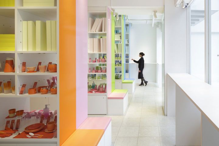
Straight Floor plan used by Corazys Store in Tokyo Partitioned by Large Shelves Creating Aisles.
Installing a floor plan is regarded as being extremely important due to it being the foundation of a store’s fitout. A floor plan gives the structure through which to understand and organise all other aspects of a commercial space. A straight floor plan is suggested to be a strong choice as it is one of the most efficient and economical options to get the most out of a store’s fitout. The straight floor plan makes the most practical use of both floor and wall space in a fitout, such as commonly unused areas like corners. As small businesses only have access to a small amount of floor space, wall fixtures are commonly suggested as something to incorporate into a fitout as they are seen to be effective and affordable.
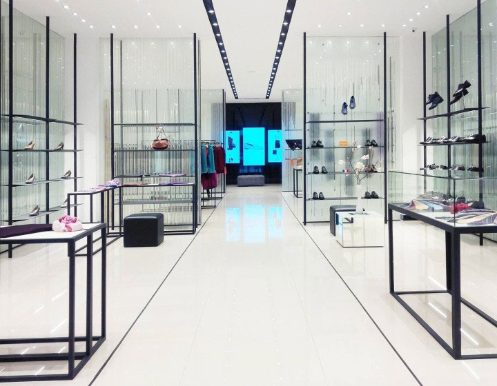
A Format Store in Vietnam’s use of a Straight Floor Plan
Through their experience in shopfitting on the Gold Coast and in Brisbane, Fast Fitouts have seen straight floor plans to be highly customisable and accommodating to a wide variety of fitouts. With their expertise in fitting out commercial spaces, they have seen this layout used in spaces spanning from convenience stores, to high-end retailers.
Adam Parker, the creator of Fast Fitouts, thinks a straight floor plan is an idea worth considering due to the extreme flexibility it offers.
“To put it into perspective just how versatile I’ve seen this floor plan be, take your local grocery store as an example. I’ve built straight floor plans into these stores to simply help maximise efficiency and effectiveness. The aim of a grocery store’s fitout is to allow customers to easily view and locate all of their products.”
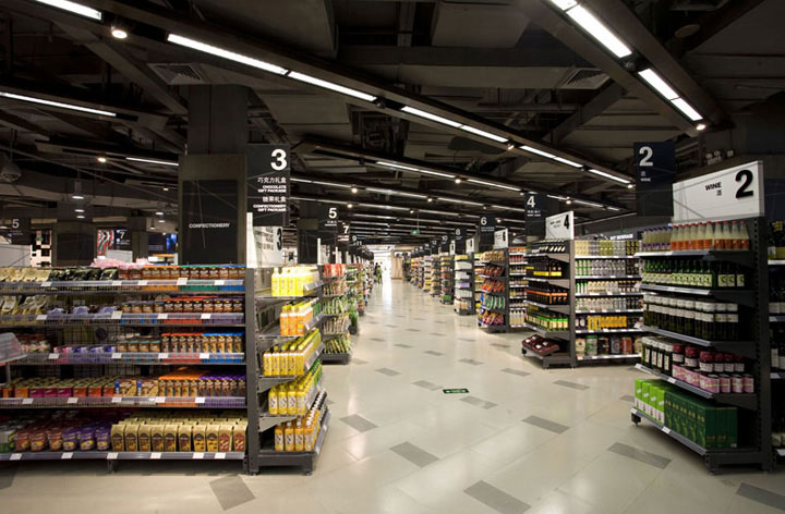
Ole Grocery Store in Shen Zen’s use of a Straight Floor Plan and Aisles.
Parker explains just how common the straight floor plan is and how he has seen it implemented across a variety of different stores throughout his career in shopfitting.
“Another example I’ve seen is in Apple Stores who also use a straight floor plan in their fitouts. Their stores are regarded as the epitome of innovation in retail and use the exact same store layout as your local grocery store. This just goes to show that you can construct most fitouts with a straight floor plan.”

Apple’s Flagship Store in Berlin Utilising Straight Floor Plan and Aisles.
After a floor plan has been installed, the size and placement of aisles are something worth considering. Though this detail is easy to overlook, it can be important to a fitout. Where you place your aisles can dictate the flow of customer traffic throughout a store. It’s suggested to keep in mind placing aisles strategically to promote maximum movement and product exposure. Parker states,
“I’ve seen aisle placement allow shop owners the ability to decide how they want their store traffic to flow. I think you need to assess where you want customers to go, and what you want them to see. Something common I’ve seen in my shopfitting career is store owners having the same general goal; wanting to expose customers to as much product as possible and also keep traffic flowing smoothly.”
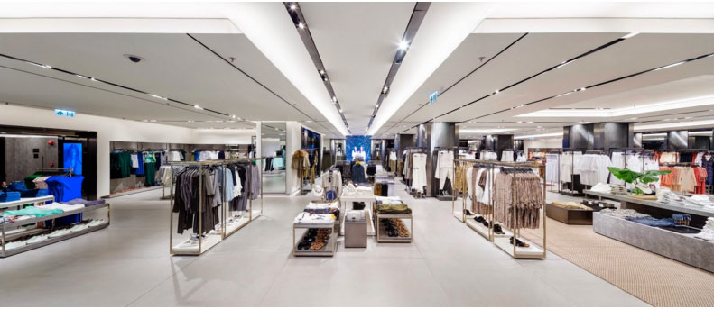
Retail Store Zara in Hong Kong Utilising Aisles Effectively.
Having spacious aisles is said to be one of the key aspects to keep store traffic flowing. This ensures aisles will be comfortable and fit for all customers, including those with strollers or wheelchairs. Having wider aisles keeps traffic flowing and ensures that customers won't invade each other's personal space.
Something to keep in mind is that too wide an aisle will encourage customers to walk briskly, sometimes allowing them to pass merchandise without engaging, narrow aisles encourage browsing, and clogged aisles will make customers turn around and leave a store. Adam Parker gives us some insight into what he’s learnt from shopfitting,
“The most common strategy I’ve seen our customers implement is establishing aisles that are narrow enough to force customers to slow down, but wide enough so they’re able to notice the products displayed without interruption or congestion. We’ve built a variety of spaces that have used aisles, and I’ve seen this to be good way to keep customer flow manageable.”
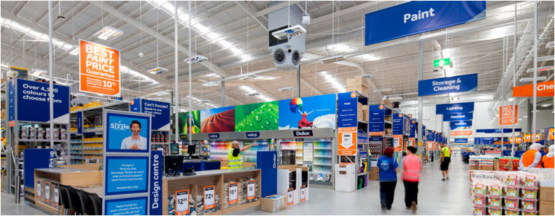
Masters Home Improvement Aisle Layout with Straight Floor Plan.
Fast Fitouts have built shop spaces from large to small and have seen many options installed regarding aisle placement. All placements direct customer traffic and highlight products in different ways. As with all components of a store fitout, it’s up to the customer to decide what aisle layout will best benefit their internal customer flow and product exposure. Parker has seen many smaller stores opt for free-flow layouts to better utilise their space.
“I’ve been involved with a few small shops looking to use a free-flow fitout. This has been because they have less inventory and higher-end merchandise and this style is said to highlight their products better.”
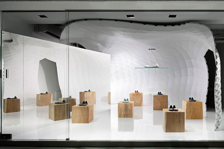
Iguaneye Shoe Store in Tokyo using a Free Flow Fitout.
The better a shopfitter understands what you want to achieve with your retail store traffic, the more effective your store fitout will be. The fitout of a store has an immediate effect on shoppers and communicates to them whether they want to browse an establishment or not. Understanding what fitout suits your space best is fundamental to any build of any commercial space.
*Fast Fitout’s is not licensed to advise or sell designs for shop spaces. If you are in need of plans for your future fitout we are always happy to refer you to our friends in design who can help you get started on creating your perfect space.
Lets GEt The Ball Rollng!
Enquire NowShare this Post
Related Articles

New Onsite Process: Crossing our T’s and Dotting our I’s
A Letter To Our Friends: For almost three decades, we have been priding ourselves on being your handy, go-to problem-solvers with respect to renovations and refurbishments throughout Brisbane and the Gold Coast. Yet, like every other business, we find ourselves in a moment of time that requires adaptation, resilience and cooperation.

To Expand or Downsize Your Retail Space?
When it comes to brick-and-mortar retail spaces, business owners, designers and shop fitters will put plenty of thought into one central objective — increasing sales.

The Impact Your Office Design Has On Mental Health
Your office design and layout is the key to cultivating a positive and productive place to work. Here’s what every business owner should do to tackle the challenges faced by a burnt out modern workforce.

